I had the pleasure of working with Steff in two spells at Booking.com - and on both occasions considered him to be one of the most talented and dedicated developers in the company. His commitment to shipping exceptional work goes far beyond the boundaries of his role, and he is as effective giving design critique as he is writing considerate and robust javascript.
Steffan is a rare breed of user-focussed developers with an eye for great design, and that makes him a great team member.
biq
The desktop application that became the single source of truth for Booking.com's design system — delivering tokens, components, and documentation to hundreds of designers and developers.
CompanyBooking.com
Timeline2016–2020
RoleSenior UX Engineer
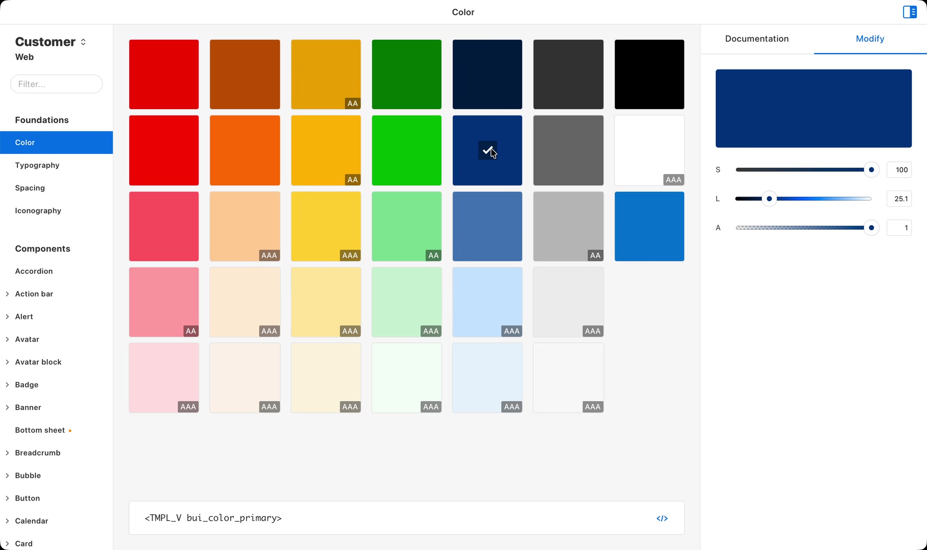
biq became the source of truth for 700+ designers and developers, delivering tokens, 146 components across three platforms, and their documentation. Its palette distilled 97,000 values in use to 33 accessible colours, significantly improving conversion while increasing accessibility.
Thousands of experiments, no shared system
I joined Booking.com in 2016 as the founding engineer on its design system — back when it was just me and Stuart Frisby, the Director of Design. This is the four-year story of the tool we built to make that system something the whole company could actually adopt.
At Booking.com, we thrived on experimentation. Every detail, from the checkout flow to the colour of a single button, could be an A/B test. There were thousands of experiments running at once. It was a culture where data trumped design opinions, and change was constant.
That mindset drove innovation but made consistency nearly impossible. Without a unified design system, teams designed and built in isolation. Patterns drifted, components duplicated, and it became harder to maintain a cohesive experience while moving fast. Guidelines were never going to be enough. We needed infrastructure that could move as quickly as our experiments.
We had started building design tokens, components, and documentation to solve this, and quickly learned that having the right design decisions wasn't enough. With roughly 200 designers and 500 developers spread across more than ten product verticals, the real challenge wasn't creating the system. It was getting everyone to adopt it.
Our answer, biq.
A desktop app that became the home of our design system. A living source of truth for tokens, components, and documentation. It gave designers and developers a shared foundation while keeping pace with Booking.com's culture of rapid testing and iteration.
Colour: 97,000 values down to 33
We started with colour. Through extensive A/B testing across the website, native apps, and partner tools, I identified over 97,000 colour values in active use across Booking.com. Most were slight eye-dropped variations of our original palette — close, but not quite. In an environment where anything could be tested and a colour could be added ad-hoc on the strength of a result, the palette had exploded.
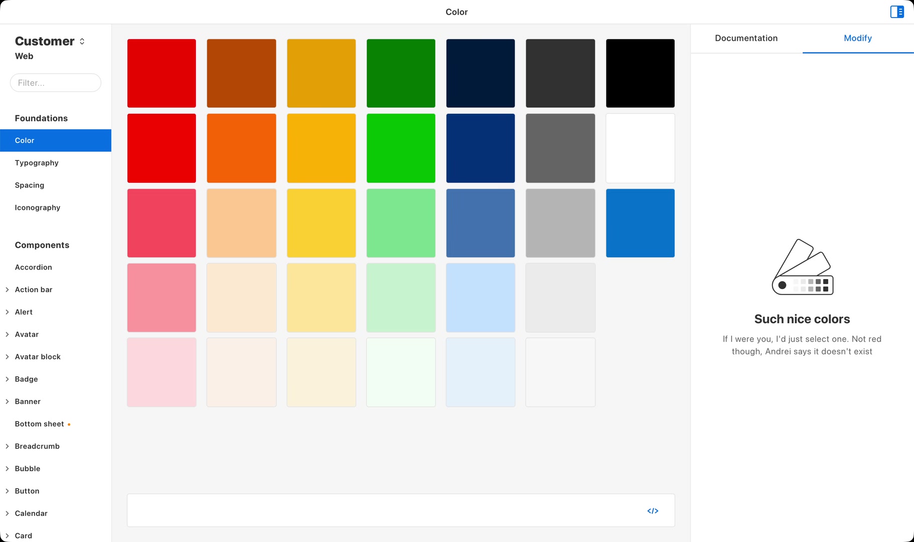
Our challenge was distillation. Testing which colours moved metrics was only half of it; the rest was consolidating thousands of near-identical variations into a coherent system. We went from 97,000 colours down to a validated palette of just 33, proven to significantly move metrics that mattered. The winning palette improved conversion while also improving accessibility, visual affordance, and coherence across an ecosystem shaped by years of rapid evolution.
Destructive
Callout
Complement
Constructive
Primary
Neutral
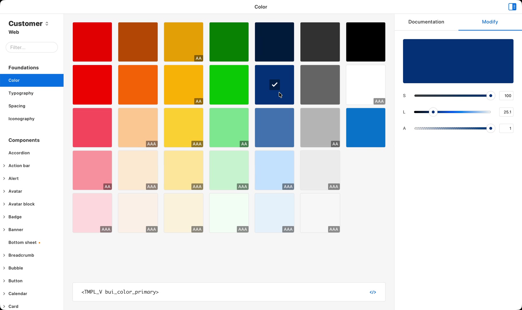
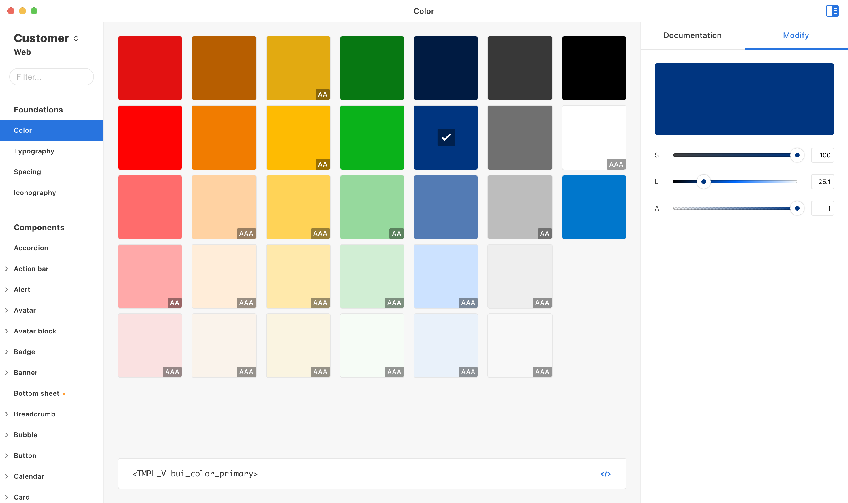
Consolidating to 33 tokens was half the battle. Designers had established workflows, so the new system had to be easier and genuinely more convenient than what they were already doing. biq became the central place to explore the full palette, validate accessible pairings with built-in WCAG contrast checking, and export a token in whichever format the work needed, in a single click. With the companion Sketch plugin, a designer could apply a colour to a layer with a single keypress straight from biq. The contrast checker ran automatically, surfacing compatibility as they explored. Rather than forcing new behaviours, we made their existing work faster.
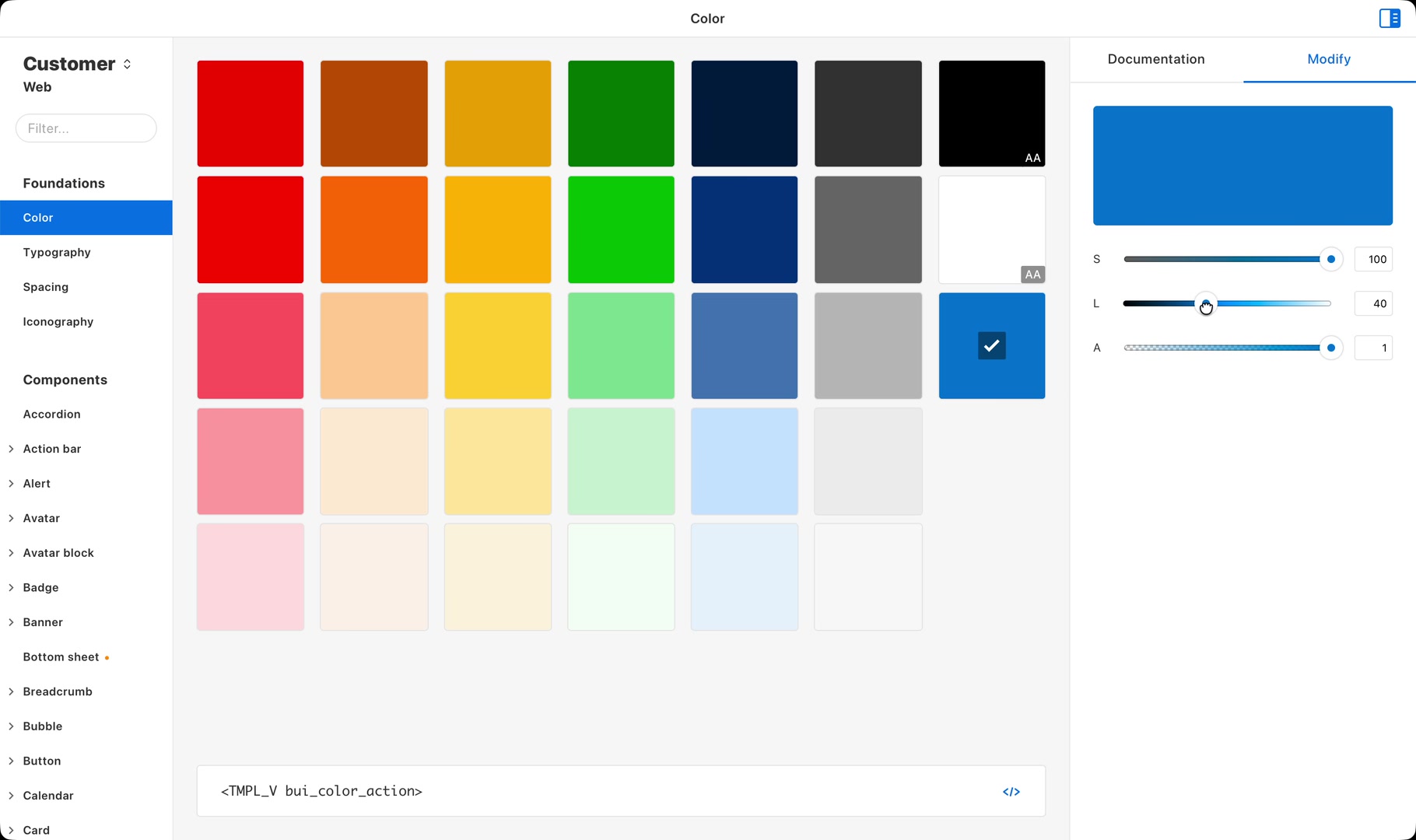
For the edge cases the system didn't anticipate, biq offered an escape hatch rather than a dead end. Precision controls to nudge a colour's saturation and lightness while keeping its hue locked to brand. A full compatibility matrix sat alongside the live contrast check, so designers could see at a glance which tokens paired safely. Customisation stayed possible, and the easy path stayed the accessible one.
Type: a curated scale on system fonts
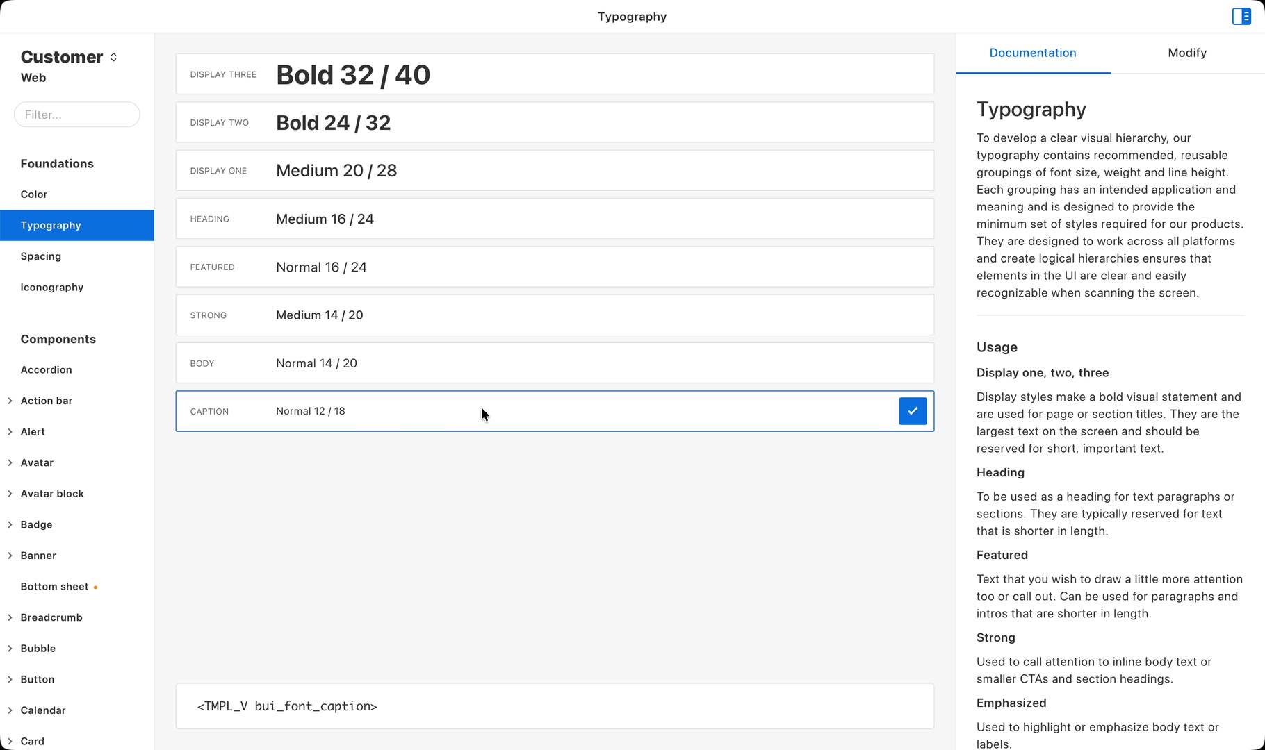
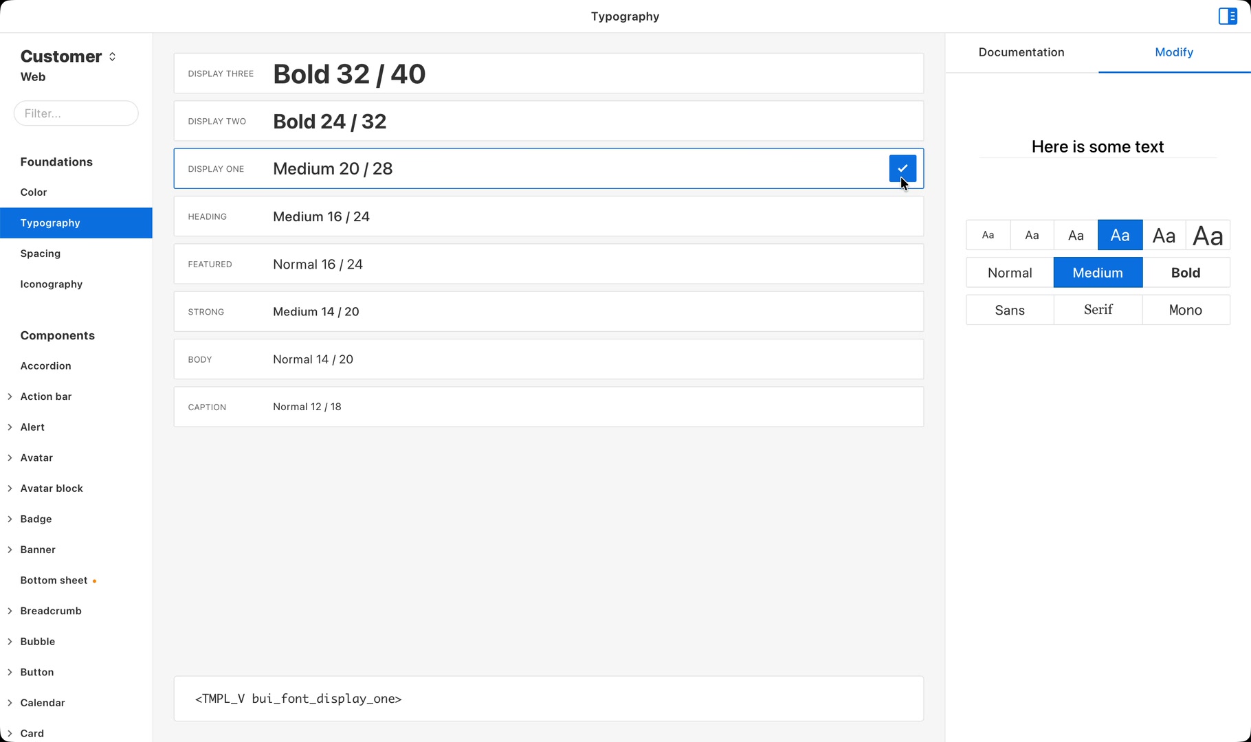
Inspired by work from Medium and GitHub on system fonts, we tested a system font stack across our products and shipped it broadly across web and apps. It improved legibility while letting us remove the dozen or so typefaces that had crept in over the years (Implementing System Fonts on Booking.com: A Lesson Learned).
A small curated set of styles worked identically on iOS, Android and web. Each was documented for when to reach for it, so a heading in the app and a heading on the site became the same decision.
Teams already had their own type scales, so the real test was getting everyone onto a shared one without forcing it. Rather than dictate strict rules, we built the exploration into biq itself: try a combination, see it render, get the code. Going beyond the curated styles stayed supported, with clear guidance on when a custom combination made sense. biq made exploration easy, which made adoption natural.
Spacing: eight steps that ended the guesswork
Spacing is the foundation nobody notices until it's wrong. Before the system, our guidance lived in informal notes scattered across documentation, so a designer either guessed at a value or worked out the relationship between two elements by hand, every single time.
The ramp was deliberately short. Predictable, scalable units gave layouts hierarchy and breathing room, with enough steps to create proportion but few enough that choosing one took no thought.
- 4px
- 8px
- 16px
- 24px
- 32px
- 48px
- 56px
- 64px
Once those values were a keypress away in biq rather than a calculation, spacing stopped being something anyone deliberated over and became part of how they worked, invisible infrastructure that kept designs consistent without anyone thinking about it.
Icons: faster to find than to draw
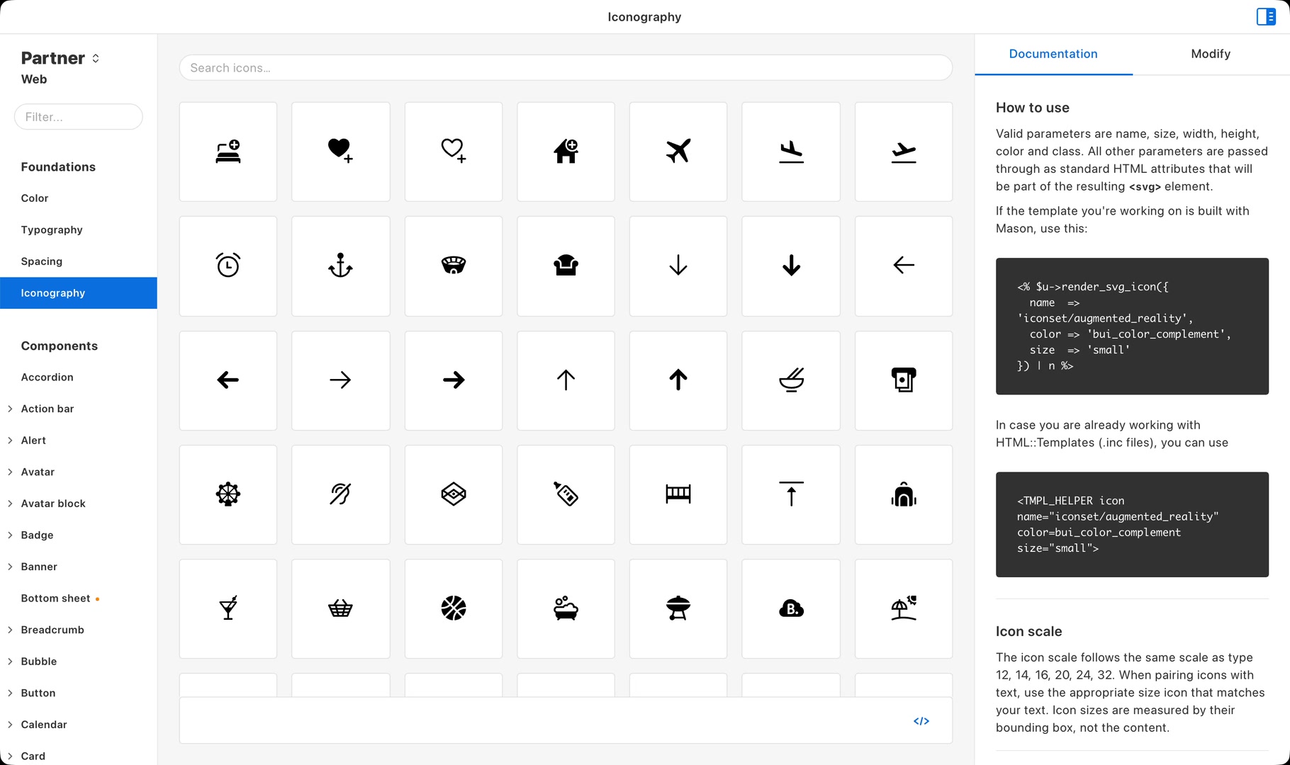
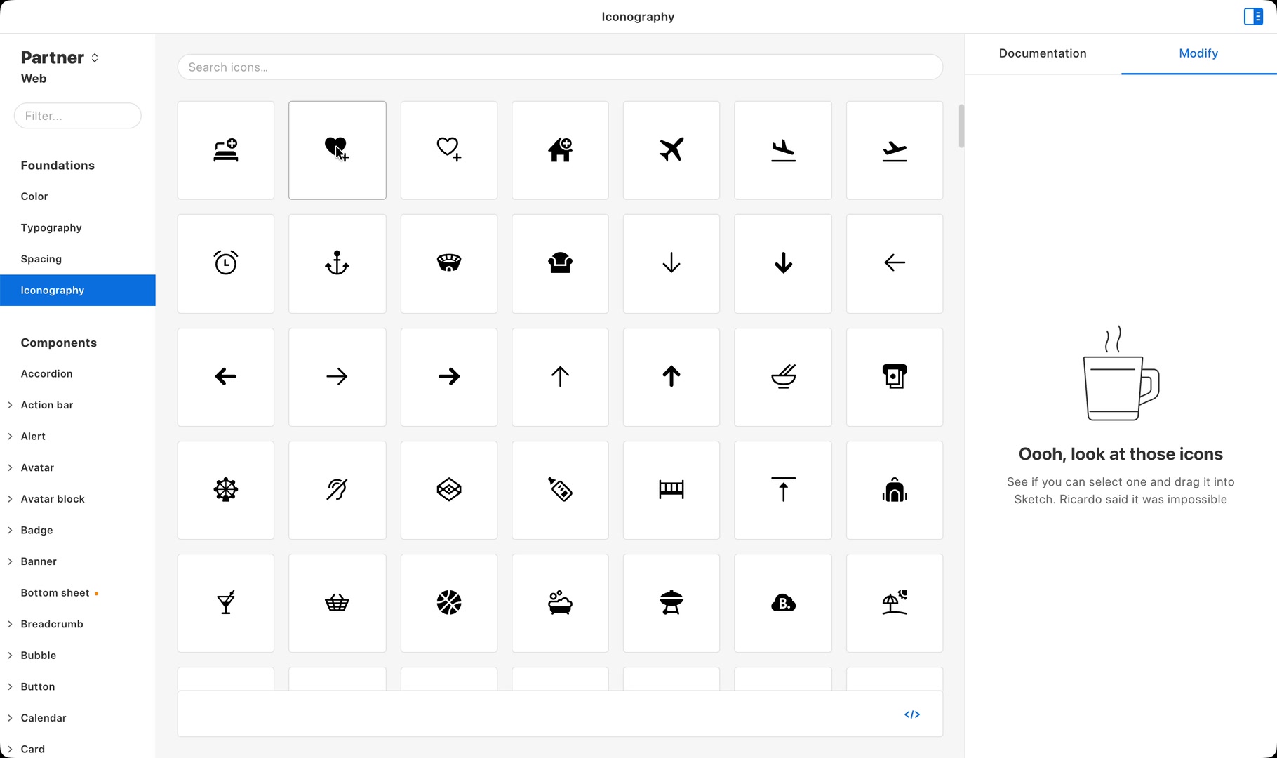
With a growing set of strong design foundations delivered through biq, icons were the next natural step. A browsable taxonomy of names, categories and keywords sat alongside usage guidelines and examples, so teams could find exactly what they needed and apply it consistently across platforms.
biq made our icon library truly accessible through a powerful search and seamless integration with our design tokens. Designers could apply tokens for size and colour in biq, then drag out ready-to-use assets directly into their design tools. Developers could adjust an icon in the same place and copy code that matched those exact settings. With built-in usage guidelines and examples, using the right icon became faster than creating a new one. Once again, the right way was the easier way.
Components: every platform, design and code
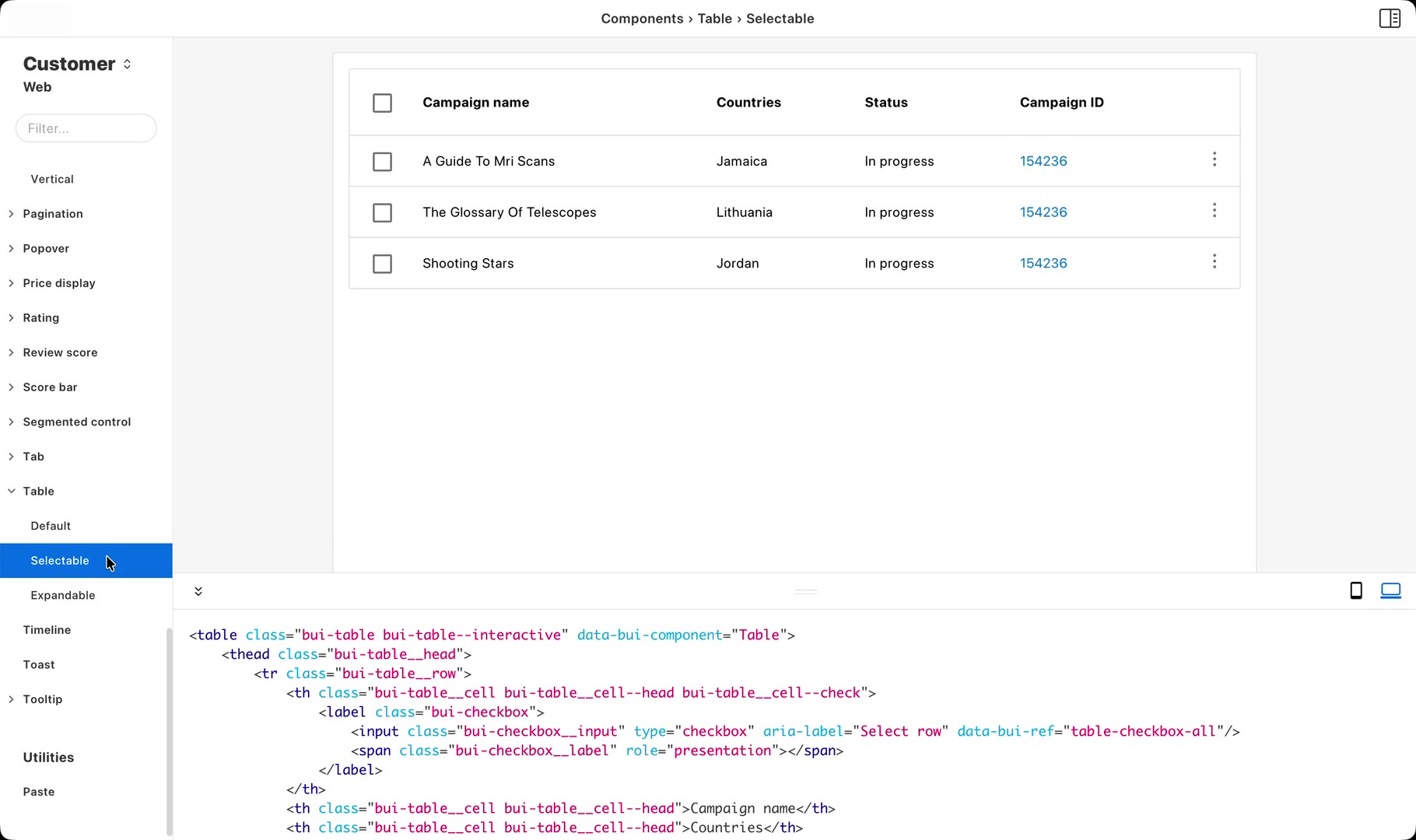
The ultimate test was components. Through cross-functional workshops across our ten-plus product verticals, we audited products for repeating patterns and built a library that grew to 146 components across Web, iOS, and Android.
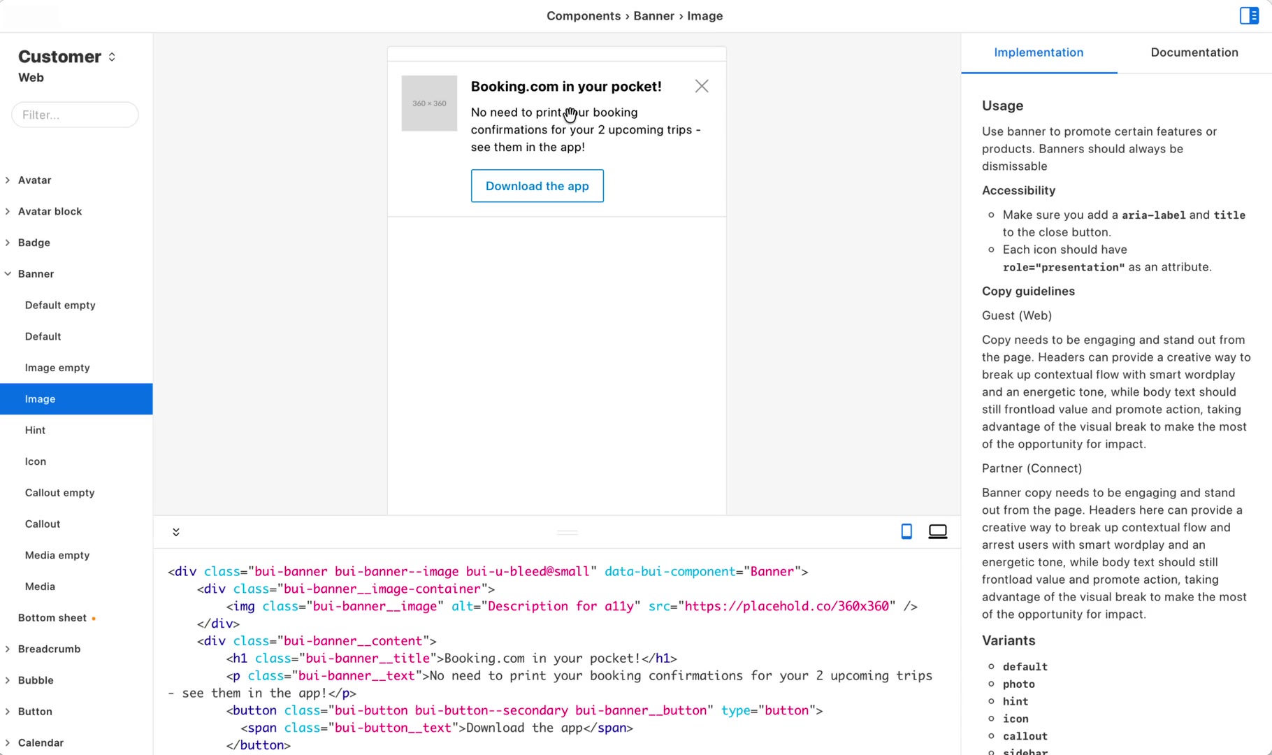
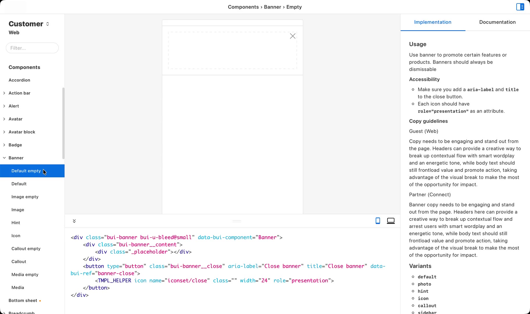
Everything a team needed to use a component lived with the component itself. Previews rendered live in the app, so designers saw the real thing rather than a picture of it. Drag-and-drop into Sketch meant no more hunting for design files, and shown alongside usage documentation. Developers copied code snippets with the full API alongside them. With all of it in one place, biq became the fastest path from idea to implementation.
Distribution: the design system installs itself
A design system only matters if people can use it, so distribution was every bit as important as the content. It's why biq was a desktop app rather than a website.
Sketch was the design tool across Booking.com, and at the time it had no concept of shared libraries or centralised assets, so I built biq with Electron, using its local filesystem access to install and manage everything designers needed. biq shipped as a signed macOS app that updated itself, pulling the latest assets from our servers and automatically installing the right Sketch libraries and plugins straight into each designer's setup. No downloads, no version-chasing, no "which library are you using?". Onboarding a new designer became as easy as opening an app, and the design system just appeared, current and correct, as if by magic.
biq connected straight to our Git repositories, so the tool and the source of truth were never out of step. Every commit propagated: updated components, refreshed code snippets, new documentation. And because each platform spoke its own language, biq handed every team the format it actually needed, with libraries and variables for Sketch, Perl templates for web, Swift for iOS, and Kotlin for Android. Same tokens, same components, no drift.
Impact: a system people trusted
biq gave the design system a home, and made it something people could trust. Designers and developers had one place to reach for. What they found there was current, accessible by default, and worked wherever they were building: Sketch, web, iOS and Android. Nobody had to verify it, chase a version, or ask whether it was still right. Trusting the system took no effort, so using it took no persuasion.
~700designers and developers receiving automatic updates
1000+active experiments at any given time, with a consistent design language
10+product verticals supported across Web, iOS, Android and Email
That trust is what turned biq from a tool into infrastructure. Its libraries reached hundreds of customer-facing projects, onboarding a designer became as simple as opening biq, and design and engineering finally reached for the same values under the same names. By keeping pace with the experiments running around it, biq let teams move faster while giving customers a more consistent, accessible experience.
Takeaways
Distribution is as important as creation
You can build the best design system in the world, but if hundreds of designers can't find it, adopt it, and stay in sync as it changes, it may as well not exist. This was the insight biq was built on, so I spent as long on the pipes as on the content. Signed releases that installed themselves. A direct line to the repository. A different output format for every platform that needed one. None of that work shows up in a component-library screenshot. All of it is why the design system got used.
Make the right way the easy way
Every feature followed the same rule: remove friction until the correct choice is also the path of least resistance. The alternative is enforcement, and enforcement was never going to keep pace with thousands of experiments running at once.
Evidence beats opinion
In a culture where data outranked design taste, "it looks better" was never going to carry a design system. We earned our way in with proof instead: A/B testing tokens on live products before standardising them, and distilling 97,000 colours in active use down to a validated palette of 33. Showing that the system moved the metrics teams already cared about turned every adoption conversation from a request into an offer.
A design system is an ecosystem
biq worked because it was more than a library. Tokens, components, icons, documentation and distribution all connected through the same infrastructure, giving designers and developers a continuous path from discovery to implementation.
The system wasn't something teams had to stop and visit. It met them where they worked, stayed current as it changed, and connected design decisions to production. Foundations alone don't change behaviour; the ecosystem around them does.
Footnotes & Appendix
-
What's in a name? biq is short for Booking Interface Quality. When the project began, it was just me and Stuart Frisby, the Director of Design, who'd already named our team Interface Quality. Naming is hard. We later renamed to Design Systems as the team grew.
-
I took a slightly cavalier approach to rolling out the colour tokens. I extended our build system so that it scanned every HTML, CSS, JS and Perl file we had, and wherever it found a colour, it swapped it for the nearest value in our token system. Anyone could commit whatever colour they liked; it would simply render as the closest token. That let us run colour experiments across the whole of Booking.com and iterate on the system incredibly quickly.
-
This is before the days of Storybook, Figma, or Style Dictionary, so we had to build our own solution.
-
The colour system started with over 97,000 colour values in active use across Booking.com. Most were eye-dropped variations that were close to existing colours but not quite exact.
-
Web components were built in Perl templates — yes, really — and jQuery. Think of these components as a bit like shadcn/ui components, but for Booking.com. JS and CSS was shipped in common libraries, so we could use the same templates across all products. Before you ask, yes, we did eventually move to more modern technologies.